Ideas worth taking with you

Presentation stories

Practical ideas for making complex information clearer, designing stronger slides, and communicating with greater impact.

Slide Design

Saving a low-resolution image

A useful image is sometimes available only at a resolution too low for a large presentation slide. Simply enlarging it exposes blur, compression and pixelation, but a deliberate stylistic treatment can make those flaws less distracting. Crop the image…

Read story
Slide Design

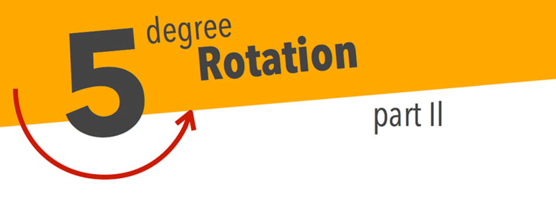
Five Degree Rotation

A title does not always need to sit horizontally across the top of a slide. Rotating it by five degrees can introduce energy, create a stronger relationship with an angled image and give the composition a more distinctive character. The angle is…

Read story
Slide Design

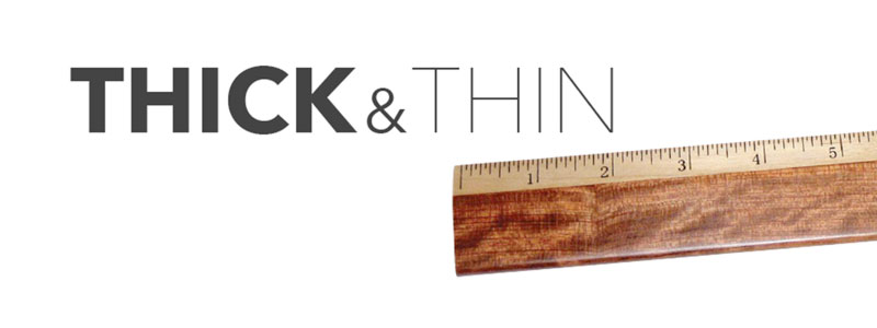
Thick and Thin

Font weight provides a simple way to create emphasis without introducing another colour or graphic. Pairing thick and thin forms within the same type family establishes contrast while maintaining visual consistency. Important words can carry greater weight…

Read story
Slide Design

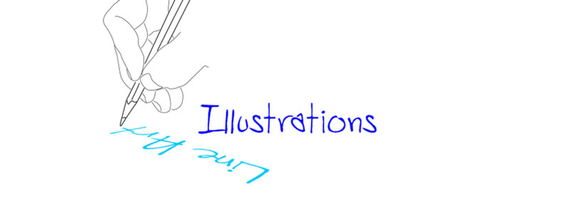
Line Art illustrations

Photographs contain texture, background detail and visual personality that may be unnecessary for a simple presentation message. Line-art illustrations remove much of that complexity, leaving recognisable outlines that can communicate an object or action…

Read story
Slide Design

Colour, Contrast, and Size

Text alone can create a powerful presentation slide when colour, contrast and size establish a clear hierarchy. A key phrase in a contrasting colour attracts attention, while a larger number or heavier word communicates importance before the audience reads…

Read story
Slide Design

Growing Numbers

Copying a spreadsheet onto a slide may preserve all the data, but it rarely communicates the one number the audience needs to remember. Select the values that show the important change and present them directly. Increasing the physical size of each…

Read story
Slide Design

Focus on Titles

Placing every title at the top of every slide creates consistency, but it can also make the presentation feel governed by a template. The title may work better in the centre, near the bottom or integrated with the image when that position strengthens the…

Read story
Slide Design

Make labels exciting

Labels should help the audience identify information, not send them searching across a busy slide. Small text, long leader lines and weak contrast make diagrams tiring to follow. Bring each label closer to the object it describes, shorten the wording and use…

Read story