Ideas worth taking with you

Presentation stories

Practical ideas for making complex information clearer, designing stronger slides, and communicating with greater impact.

Visual Thinking

Pie as you like

A standard pie chart often gives every segment the same visual treatment, even when only one comparison matters to the presentation. Rebuilding the chart manually with shapes provides greater control over size, colour, labels and emphasis. A selected segment…

Read story
Slide Design

Whitespace improves readability

Whitespace is not wasted space. It gives words, images and numbers room to breathe, separates unrelated information and helps the audience recognise what matters. Filling every available area may make a slide appear comprehensive, but it also creates visual…

Read story

Visual Thinking

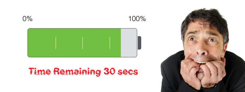
Battery Life 30 secs

A familiar battery indicator can become a useful visual metaphor for energy, progress, capacity or time remaining. Recreating one in PowerPoint or Keynote is also a compact design challenge: build the object from basic shapes, establish clear levels and use…

Read story
Storytelling

Take a bite at simple

An apple is simple, familiar and immediately understood. Presentation content should aim for the same clarity. Complex ideas may require careful thinking, but the audience should not have to struggle with the way those ideas are expressed. Remove what does…

Read story
Slide Design

Vary font size for clarity

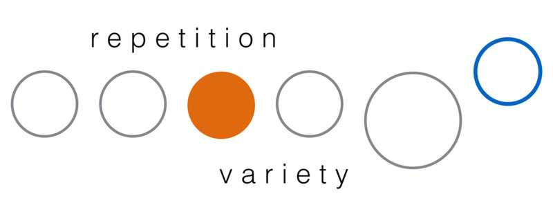
When every word and number uses the same size, the audience has no visual clue about which information deserves attention. Varying font size creates hierarchy: the key figure or phrase becomes prominent, supporting details remain available and the message…

Read story
Slide Design

Removing clutter in charts

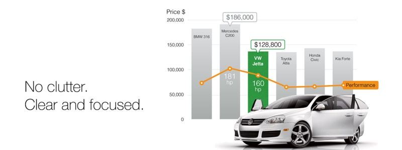
Charts often inherit gridlines, borders, legends, labels and colours that add visual weight without improving understanding. Every unnecessary element competes with the data and makes the audience work harder to find the message. Begin by deciding which…

Read story
Slide Design

Infographics LOVE or HATE

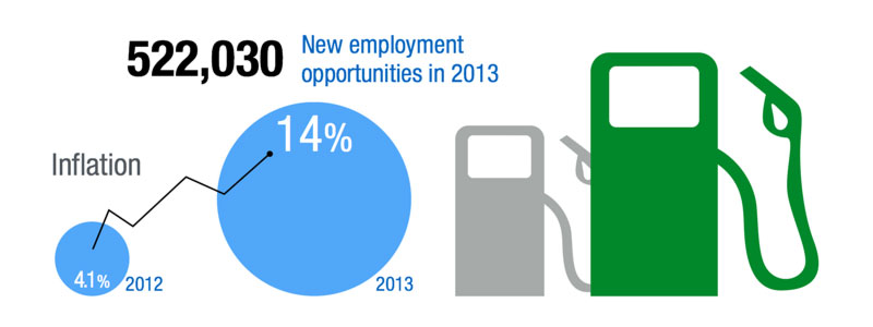
Infographics can make information more accessible, but a format designed for a poster or magazine does not automatically work on a presentation slide. Dense infographic layouts invite close reading, while slides must communicate quickly from a distance…

Read story
Slide Design

Amazing Sticky Christmas 2014

The end of a year offers a moment to pause, look back at the path travelled and recognise the people who made the journey possible. Sticky SPY began with an instinct, a passion for visual communication and a desire to build something meaningfully different…

Read story