Ideas worth taking with you

Presentation stories

Practical ideas for making complex information clearer, designing stronger slides, and communicating with greater impact.

Slide Design

It tastes better with Chopsticks

Chinese food somehow feels more authentic when eaten with chopsticks. The tool becomes part of the experience, just as the way information is presented becomes part of how an audience receives it. A message placed in the wrong format may still be understood…

Read story
Slide Design

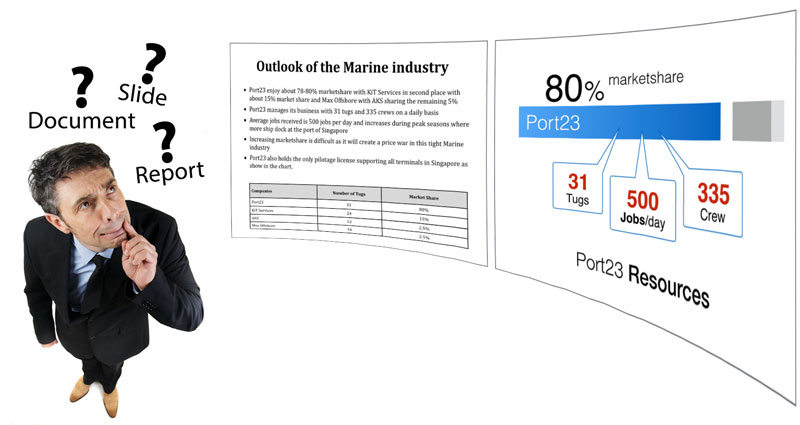
Slides are for SEEing. Reports are for READing.

Reports are created for readers who can move through detailed information at their own pace. Presentation slides are seen while the audience is also listening to a speaker. Placing report-style paragraphs, tables and explanations onto slides forces people to…

Read story
Slide Design

Presenting uptrend data

An upward trend is commonly shown with a line chart, but the chart may contain more visual information than the presentation needs. When the important message is simply that a number has grown, displaying the values themselves in progressively larger sizes…

Read story
Slide Design

Give photos on your slides a 5-degree rotation

Photographs placed perfectly straight can sometimes make a slide feel rigid and predictable. Rotating selected images by only five degrees introduces a subtle sense of movement and gives the arrangement a more natural, informal character. The effect works…

Read story
Storytelling

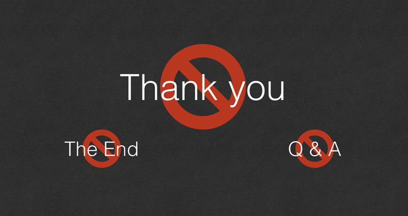
Do not show 'Thank you' on your last slide

The final slide remains visible during the closing moments of a presentation and often throughout the question-and-answer session. Filling that space with “Thank you”, “The End” or “Q&A” gives the audience nothing meaningful to remember. Use the last slide…

Read story
Slide Design

Creating Visual Separation with a Boxed Title

A title can lose its authority when it sits too close to the content below or competes with surrounding visual elements. Placing it inside a simple box creates immediate separation and establishes a clear hierarchy without requiring more text or decoration…

Read story
Slide Design

Ten ideas for exciting business charts

Default spreadsheet charts are designed to display data, not necessarily to communicate a presentation message. A business chart becomes more engaging when unnecessary elements are removed and the important comparison is given visual priority. Numbers can be…

Read story
Storytelling

How to get rid of crappy presentation slides

Poor presentation slides rarely fail because they lack decoration. They fail because too much content has been placed on the screen without a clear hierarchy or purpose. Removing unnecessary words, default template elements and competing messages creates…

Read story