Presenting survey findings can be challenging, especially when you have collected far more information than you have time to present. This was exactly the situation I faced when I had only 10 minutes to present the findings from an employee survey.
With so much data available, the first challenge wasn't designing the slides. It was deciding what to include and, more importantly, what to leave out. A presentation doesn't have to reproduce everything contained in a survey report. It needs to select the findings that matter to the audience and organise them into a story that can be understood within the time available.
For this presentation, I decided to focus on one part of the survey—employees' lunch preferences—and build the presentation around those findings.

You don't have to present everything you collected
A survey report and a presentation serve different purposes. The report can contain detailed findings, supporting data and information that readers may want to examine at their own pace. A presentation has a limited amount of time and the audience has to process the information while listening to the presenter.
Trying to squeeze an entire survey report into a short presentation usually results in data-heavy slides filled with numbers, charts and text. Instead, identify the findings that are most relevant to the purpose of the presentation. Ask what the audience really needs to know and what can be left in the report for further reading.
In this case, the 10-minute time limit forced me to make those decisions early. Rather than presenting every survey result, I selected the findings that could form a focused presentation about employees and their lunchtime habits.
Find a story within the findings
Once the information has been selected, the next challenge is deciding how the findings should unfold. Survey results don't have to be presented as a sequence of unrelated statistics. Look for connections, contrasts and patterns that can help one finding lead naturally to another.
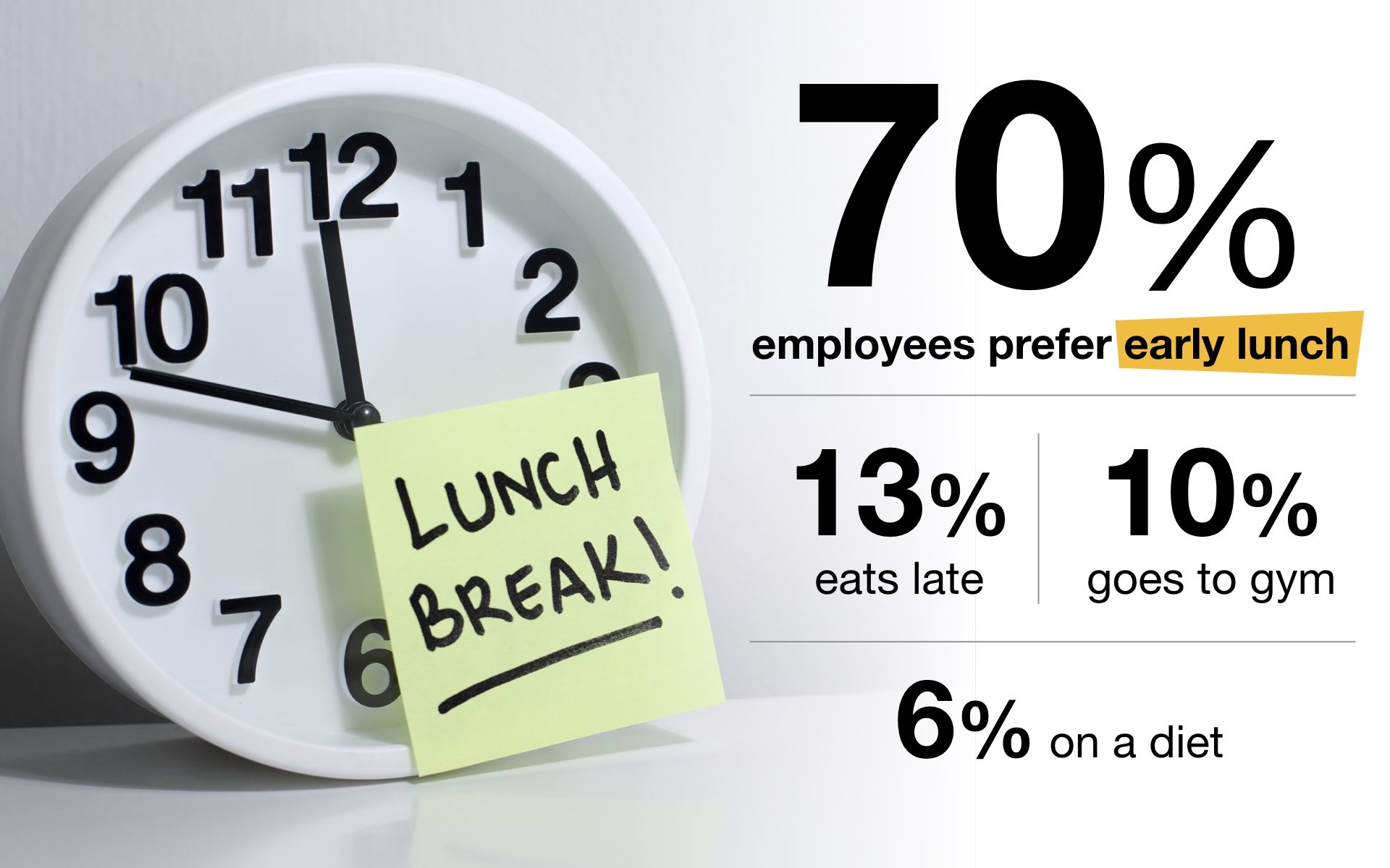
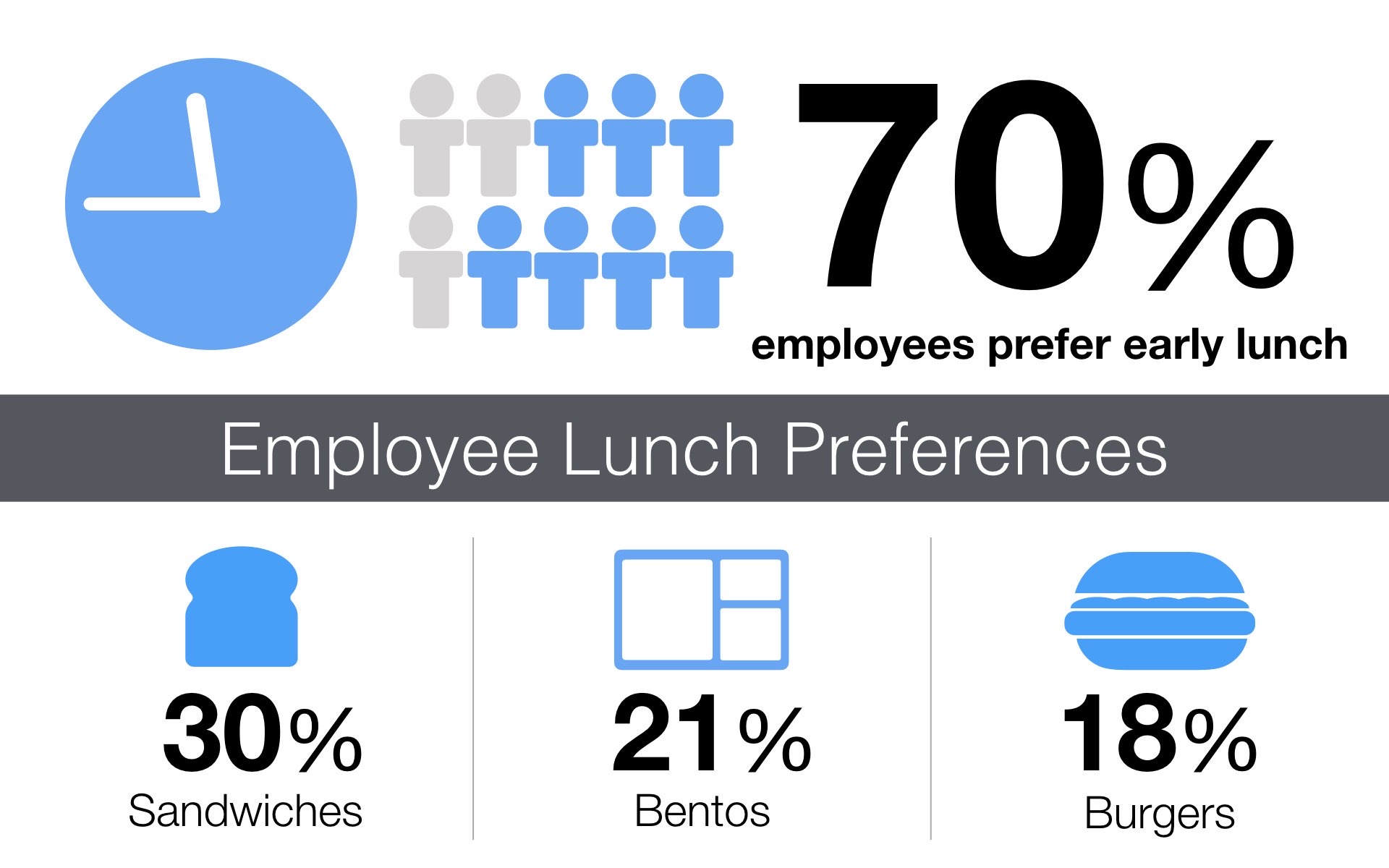
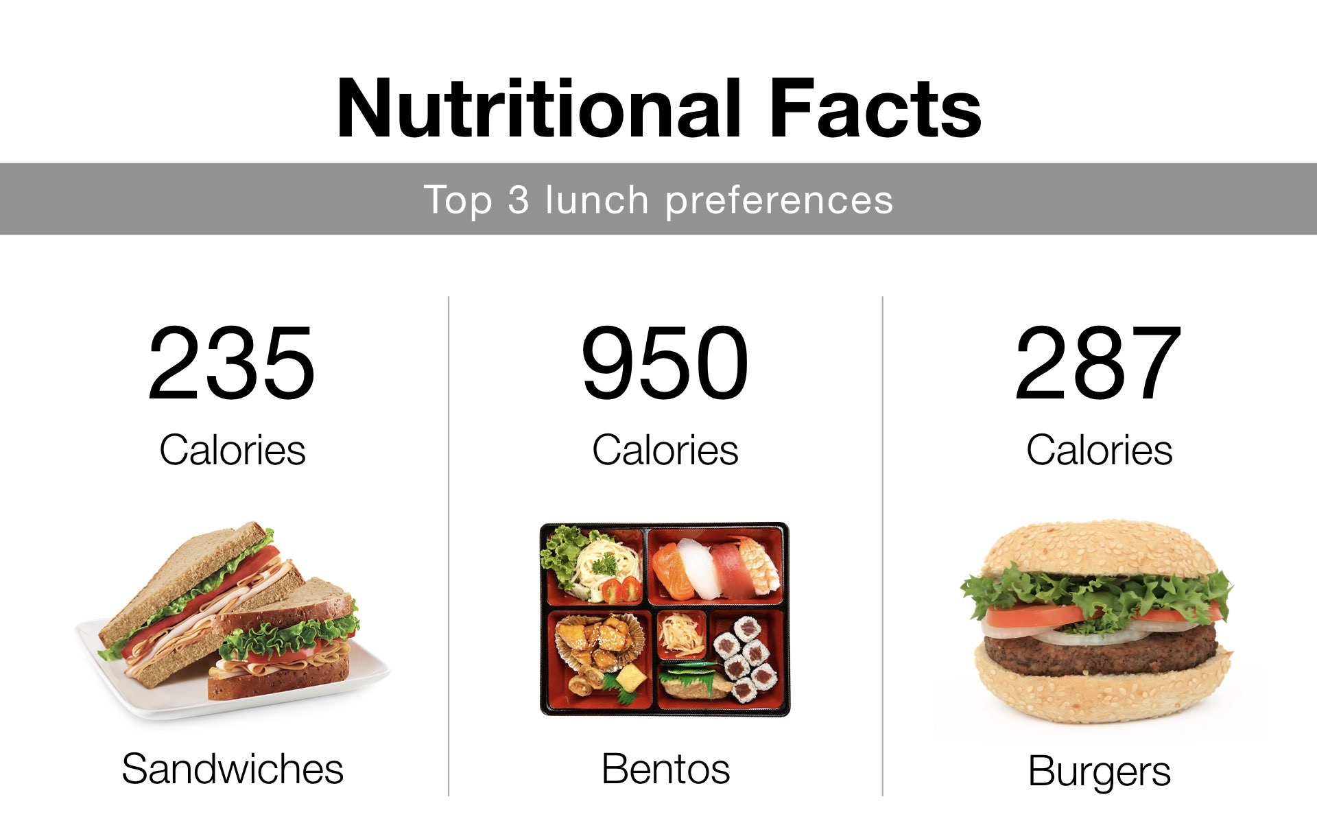
The slides in this presentation move through different aspects of employees' lunch preferences, including what they eat, nutritional information and their lunchtime behaviour. Organising the findings this way gives the audience a path through the information rather than presenting one statistic after another.
This doesn't mean inventing a story that the data doesn't support. The objective is simply to organise the selected findings in a sequence that makes sense to the audience.
Give numbers visual context
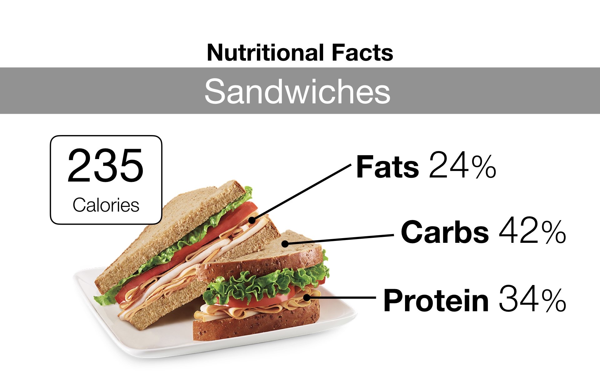
Numbers are important in a survey presentation, but numbers alone can quickly become repetitive. Appropriate photographs, illustrations and infographic elements can help give the data visual context and make it easier for the audience to recognise what the numbers represent.
For findings about food preferences, for example, photographs of the food can provide an immediate visual connection. Nutritional information can be supported with simple infographic elements. The objective is not to add images just to make the slides more colourful or decorative. The visuals should support the information being presented.
This is particularly useful when several findings have to be presented within a short period. A clear visual can help establish the subject quickly, allowing the presenter to spend more time explaining what the finding means.
Let people bring the data to life
Surveys are about people, but presentation slides filled with percentages and charts can sometimes make us forget that. If the research includes interviews or open-ended responses, selected quotations can add a human voice to the numerical findings.
For this presentation, I included comments from employees alongside their photographs. The survey numbers tell us what is happening across the group, while individual comments provide another perspective on how employees think or feel about their lunchtime choices.
A quotation should not be used to suggest that one person's opinion represents everyone. Instead, it can complement the quantitative findings and remind the audience that there are real people behind the numbers.



Look for a finding people will remember
Not every finding in a survey is equally interesting. Sometimes an exception, contrast or unexpected result can provide a memorable way to end a presentation.
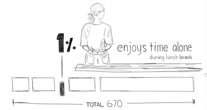
One of the findings in this survey revealed that 99% of employees preferred one lunchtime behaviour, leaving an interesting 1% who chose differently. Rather than ignoring that small group, I used it as the final visual idea.
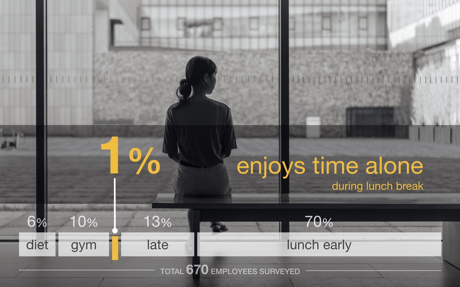
The photograph helps reinforce the contrast and gives the final statistic a human context. What might otherwise have been a small number buried among the survey results becomes a simple visual ending to the presentation.
This doesn't mean we should exaggerate unusual findings simply to make a presentation entertaining. The data still needs to be represented accurately. But when a genuine contrast or unexpected finding exists, it can provide the audience with something interesting to think about and remember.
Design the presentation around the message, not the amount of data
Presenting survey findings is ultimately an exercise in selection. Having more data doesn't mean we need more information on every slide. Decide what the audience needs to understand, organise those findings into a logical progression and then choose visual treatments that help communicate them clearly.
Numbers can be supported by photographs, illustrations and infographic elements. Quotes can bring a human perspective to the findings. Contrasts and unexpected results can create memorable moments. But every element should serve the information rather than simply decorate the presentation.
When presentation time is limited, the objective isn't to show everything you discovered. It is to help the audience understand the findings that matter.


