While updating some course content, I came across a slide I had created several years earlier to show how key information could be displayed clearly on a simple column chart. Looking at it again, I realised that the idea still applies today: a presentation chart should help the audience understand the message quickly.
Quite often, we begin with raw data and rely on the software to build the chart for us. The software does what it is asked to do. It plots every category, displays labels and legends, adds gridlines, assigns multiple colours and sometimes includes shadows or other effects. The result may be technically complete, but it can also be busy and difficult to understand during a presentation.
The problem is not the charting software. The problem is that the software does not know what we want our audience to understand.
Start with the message, not the chart
Before deciding how the chart should look, complete this sentence:
After seeing this chart, my audience should understand that...
For this example, the message was:
The VW Jetta offers a strong balance of price and performance compared with the other sedans.
This sentence became my design brief. It helped me decide which information needed to remain visible, which comparison deserved emphasis and which details could be removed. Without a clear message, every number may appear equally important and the slide can easily become a display of data instead of a communication of insight.
An analysis chart is not always a presentation chart
An analysis chart and a presentation chart serve different purposes.
When analysing data, we may need every category, value, label and reference line. We need the freedom to inspect the information, compare possibilities and discover what the data is telling us. Completeness is useful at this stage.
During a presentation, the audience does not have the same time to study the chart. They are looking at the slide while listening to the presenter. The chart therefore needs to communicate the conclusion that has already emerged from the analysis.
This does not mean hiding important data. The complete figures can remain in the report, appendix or backup slides. The presentation slide has a more focused job: make the relevant finding clear enough to understand within a few seconds.
Remove first, then add back deliberately
A practical way to simplify a busy chart is to remove its visual elements in stages:
- Remove decorative effects such as shadows, gradients and unnecessary borders.
- Reduce gridlines and axis markings to only those needed for reference.
- Remove labels and figures that do not help explain the message.
- Limit the colours, using neutral tones for supporting data.
- Add back only the values and highlights needed to prove the conclusion.
Starting with less makes it easier to see what is genuinely necessary. If we begin with a fully formatted chart and try to improve it by adding more emphasis, we may simply create another layer of clutter.
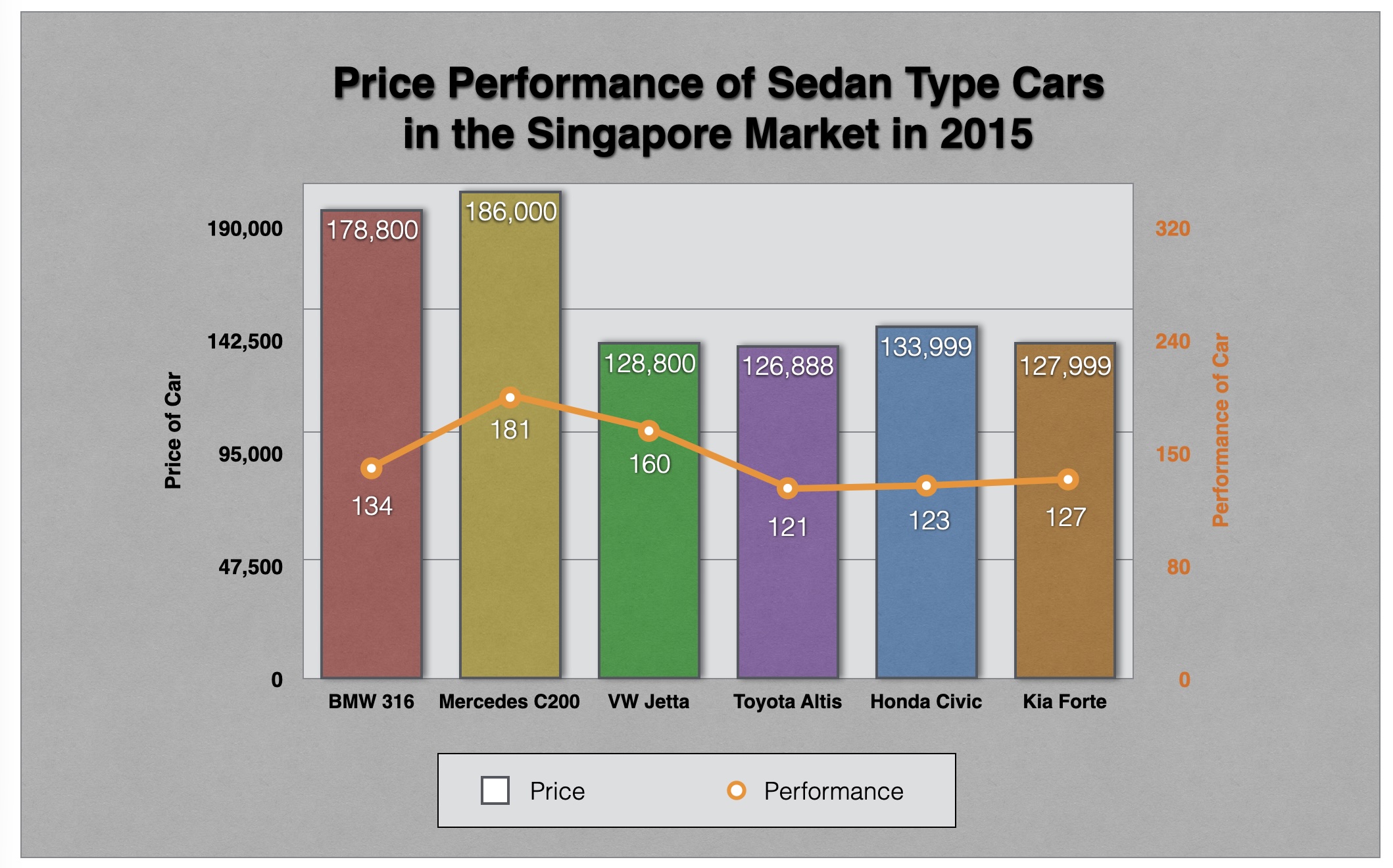
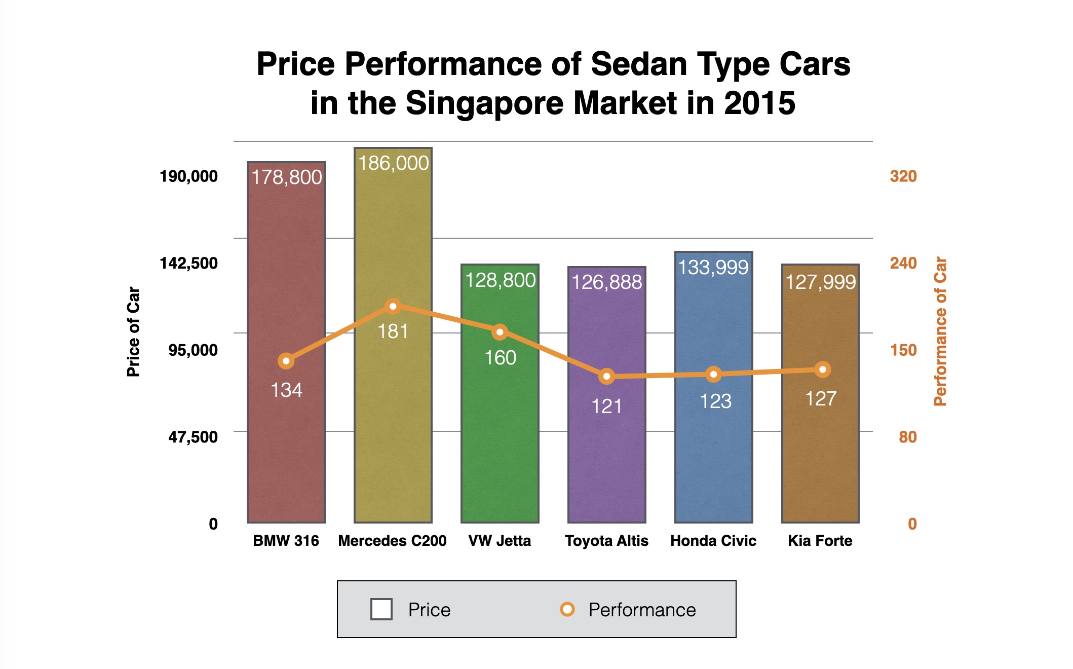
Fig. 1a shows the original chart. In Fig. 1b, the data has not changed. The background treatment, shadows, borders and other distractions have simply been removed, allowing the information to sit on a cleaner visual foundation.
Cleaning up the chart is only the first step.
Removing clutter makes a chart cleaner. It does not automatically make the message clearer. The next step is to create focus.
Highlight the comparison that proves the point
Fig. 2a neutralises the other sedans and highlights the VW Jetta. This establishes visual priority while keeping the remaining cars available for comparison.
Fig. 2b then adds emphasis to the evidence supporting the comparison. The VW Jetta costs $128,800 and produces 160 hp. The Mercedes C200 produces more power at 181 hp, but costs substantially more at $186,000.
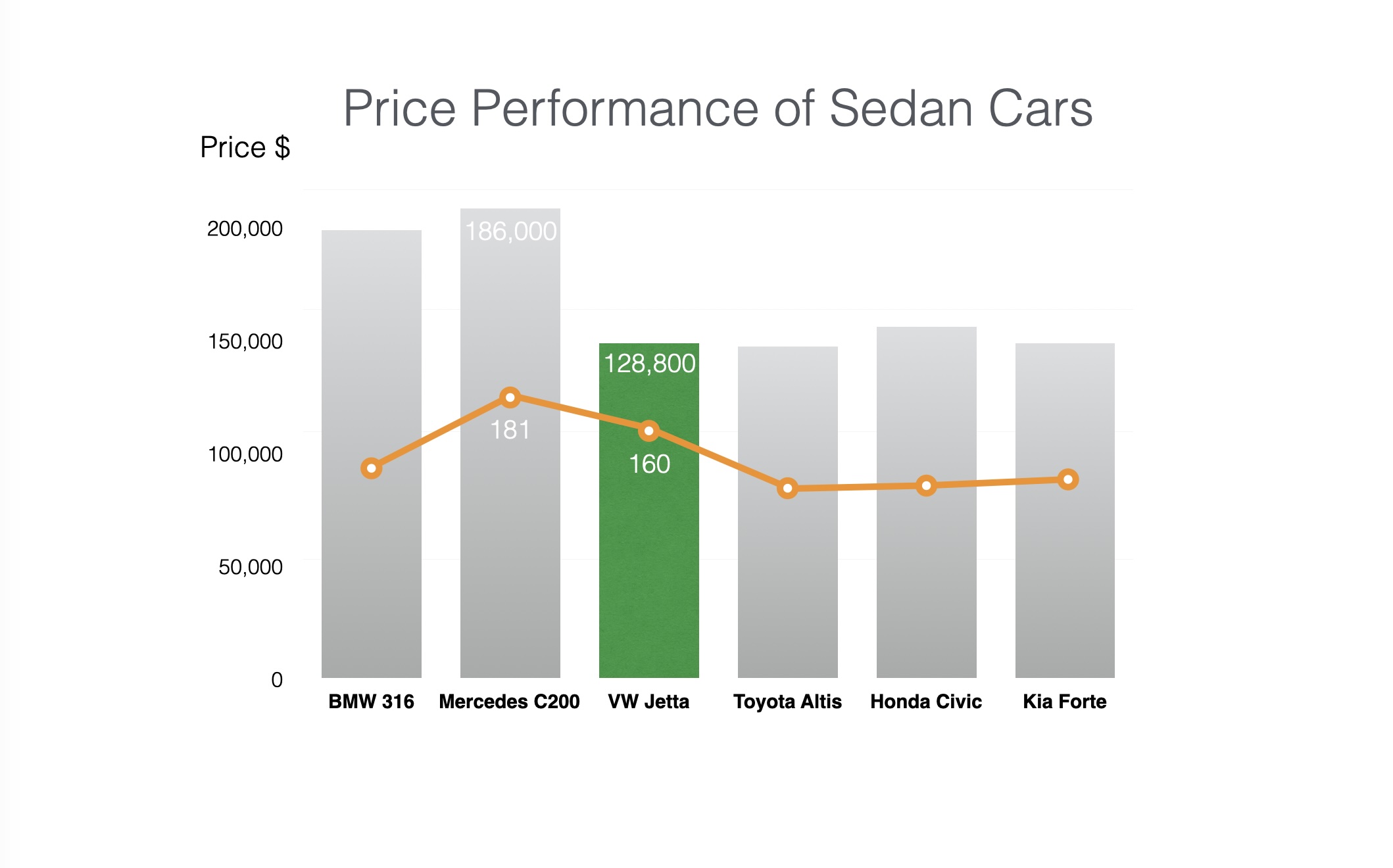
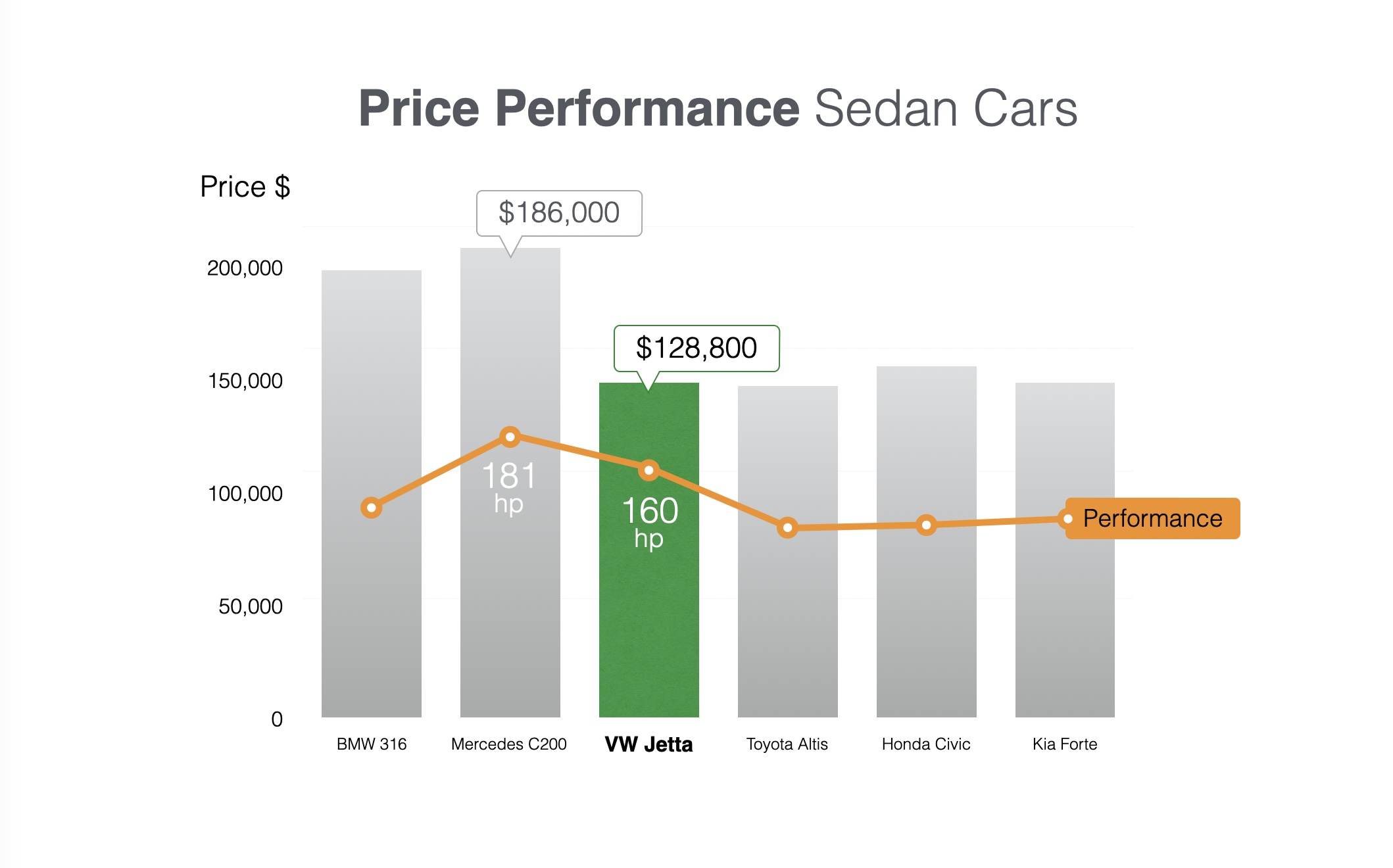
These four figures are enough to support the price-performance comparison. The remaining cars still provide context, but their exact figures do not need to compete for attention. At a glance, the audience can see the broader field while concentrating on the evidence that supports the recommendation.
By this stage, the chart has already done the analytical work. The comparison is focused, the supporting figures are visible and the conclusion can be understood without reading the full dataset.
The final step adds a photograph of the VW Jetta. The photograph gives the recommendation a tangible visual identity and creates a stronger presentation slide without adding more data. It supports the message rather than becoming another piece of information for the audience to analyse.

Simplify without distorting
Simplification should make the data easier to understand, not change what the data means. A focused chart still needs to be truthful.
Keep the scale consistent. Do not change column heights simply to make one option look better. Do not remove a value that would materially alter the conclusion. Make it clear what each visual measure represents, especially when combining different measures such as price and horsepower.
It is also useful to distinguish between a highlighted recommendation and an objective ranking. The VW Jetta is presented here as the strongest price-performance choice based on the selected measures. A buyer may consider other factors—comfort, reliability, fuel consumption or brand preference—that are outside the scope of this chart.
A presentation chart becomes more credible when its scope is clear and its emphasis is supported by the data.
The same idea applies beyond cars
Comparing two measures can reveal a more useful story than looking at either measure alone. The same approach can be applied to many types of business information:
- cost versus return;
- revenue versus profit;
- speed versus accuracy;
- investment versus impact;
- effort versus outcome.
Begin by deciding which relationship matters. Then highlight the option or comparison that best explains that relationship. The chart design follows the message—not the other way around.
When should you draw a chart manually?
Sometimes it is also easier to draw a small chart manually instead of relying on the chart function of the software. Rectangles, circles, lines and text boxes provide enough control to create a focused visual when the dataset is small and the message is already known.
Manual construction works well when the dataset is small, the message is already known and only a few values need emphasis. It gives you precise control over the visual hierarchy and is suitable for a slide that will be presented rather than explored interactively.
A standard chart is usually safer when the data changes frequently, many values must remain precise or the audience needs to inspect the full dataset. In those situations, simplify the software-generated chart carefully instead of recreating it as separate shapes that may become difficult to update.
A quick checklist for your next chart
Before placing a chart into your presentation, ask:
- What is the one conclusion my audience should understand?
- Which comparison proves that conclusion?
- What can I remove without changing the meaning?
- Which values must remain visible?
- What should receive the highlight colour?
- Is the simplified chart still truthful?
- Can the audience understand it within a few seconds?
A chart does not become more useful by showing everything. It becomes more useful when the audience can see what matters.


