
Column charts are a common sight on presentation slides. They are easy to create in software such as PowerPoint, Keynote or Excel, but the default result is not always easy to understand. A chart may be technically correct and still be overcrowded with data labels, colours, lines, shadows and other effects that compete for the audience's attention.
When we allow the software to make every visual decision, it often displays more information than the audience needs. I usually call this clutter. The audience then has to study the chart, work out what matters and decide where to look—all while listening to the presenter.
A presentation chart should do more than display data. It should help the audience understand a specific message. Reducing unnecessary visual information makes that message easier to see. The following five mistakes are common in column charts, but each can be corrected with a few deliberate design choices.
Decide what the chart needs to communicate
Before changing colours or removing labels, decide what the audience should understand from the chart. Is one category performing better than the others? Has a value increased over time? Is there a gap that requires attention?
Try completing this sentence:
After seeing this chart, my audience should understand that...
The answer determines what deserves emphasis. Information that proves the conclusion should remain visible. Information that does not help the audience reach that conclusion can usually be reduced, moved to an appendix or removed from the presentation slide.
The five mistakes to avoid
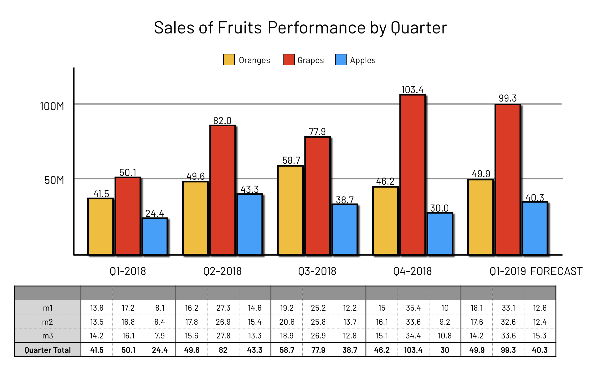
The slide below includes all five mistakes described in this story. It contains the data, but the audience must work hard to find a point of focus.
1. Too many visible numbers
Having too many numbers visible on the chart is the first mistake. If we turn on data labels for every column, the audience is presented with a collection of values before they know which ones matter. The numbers may be accurate, but their equal treatment makes the chart harder to interpret quickly.
Turn off the default data labels, then restore only the values needed to support the message. A carefully positioned label on the highlighted column may be enough. If the audience needs every exact value, provide the complete data in a report, appendix or supporting document where it can be studied at an appropriate pace.
The aim is not to remove useful evidence. It is to prevent secondary values from competing with the numbers that explain the conclusion.
2. Too many coloured columns
Filling every column with a different colour is the second mistake. When colour does not represent a meaningful category, the audience may waste time trying to understand what each colour means.
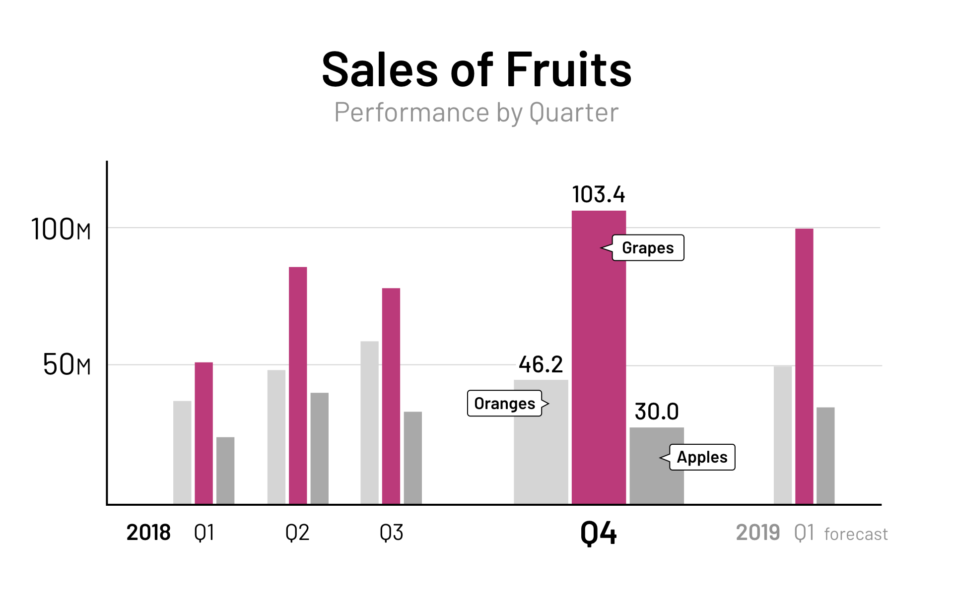
Use one bold colour to highlight the key column and a light or medium grey for the remaining columns. This creates a clear visual hierarchy: the neutral columns provide context while the highlighted column directs attention to the finding you want to discuss.
Multiple colours are appropriate when they encode genuine categories or distinctions in the data. In that situation, choose a harmonious palette and use it consistently. Secondary colours should support the primary message rather than compete with it.
3. Extra lines and shadows
Thick gridlines, chart outlines and shadow effects make the slide look cluttered. They create visual contrast without adding meaning, so they can attract almost as much attention as the data itself.
Remove decorative shadows, gradients and heavy borders. Gridlines do not always have to disappear, but they should be light and limited to the reference points the audience genuinely needs. The data should remain visually stronger than the structure surrounding it.
4. Leaving the legend turned on
A legend can explain colours in a report or document, but it often adds unnecessary work for an audience viewing a presentation slide. The viewer must look at a colour, move to the legend to decode it and then return to the chart. Repeating this process interrupts understanding.
Use direct labelling whenever practical. A short label placed beside the relevant column connects the name to the data immediately. A legend may still be necessary when a chart contains many series or direct labels would overlap, but it should not remain simply because the software added it by default.
5. Adding a spreadsheet-like table
The final mistake is adding a spreadsheet-like table below the chart. The chart asks the audience to see patterns, while the table asks them to read individual values. Showing both at the same time divides attention and often repeats the same information in two different forms.
For a presentation, show the few numbers relevant to the message instead of displaying the complete dataset beside the chart. A detailed table may still belong in a report, appendix or backup slide when exact figures are needed for discussion.
Accuracy comes before simplicity
Removing clutter should make a chart clearer without changing what the data means. Column heights communicate magnitude, so column charts should normally begin from a zero baseline. Starting the scale at a higher value can exaggerate small differences and give the audience a misleading impression.
Keep the scale consistent, preserve values that would materially affect the conclusion and label the units clearly. Simplification is useful only when the chart remains truthful.
A better column chart
The example below avoids all five mistakes. Compared with the earlier chart, the decorative effects, excessive labels, competing colours, legend and data table have been removed. The audience can now see the overall comparison and the intended point of focus without first decoding the slide.
Add visual interest selectively
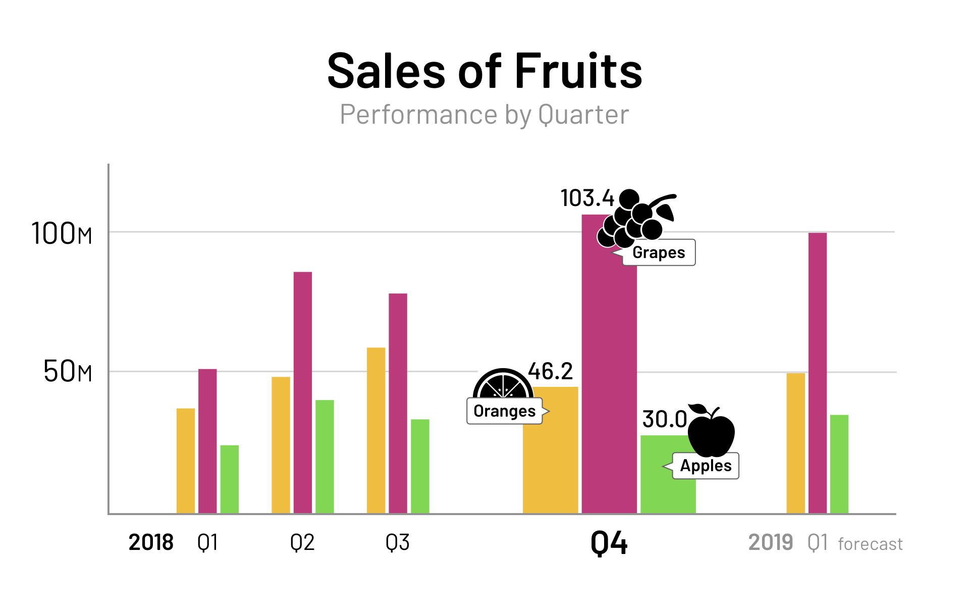
Removing clutter does not mean that every chart must be grey or visually plain. Once the information is clear, selected colours or graphic elements can add interest and reinforce meaning.
The final example uses secondary colours from a harmonious palette. Infographic elements representing the data types give the values a visual identity, but they remain secondary to the chart. They support the information instead of becoming decoration that the audience must interpret.
A quick checklist for your next column chart
Before placing a column chart into your presentation, ask:
- What is the one message the audience should understand?
- Which values are necessary to support that message?
- Does each colour have a purpose?
- Can any lines, borders, shadows or effects be removed?
- Would direct labels be easier to understand than a legend?
- Does the audience need the table, or can the detailed data go elsewhere?
- Does the chart use an honest scale and a clear zero baseline?
- Can the main finding be understood within a few seconds?
The goal is always to make things easier for the audience. A good column chart does not display everything the software can include. It presents the evidence needed for the audience to see what matters, understand the comparison and follow the message.


