
Very few of us are born great presenters. Most of us will need to learn the hard way. Some might completely shy away from presenting altogether. Still, being able to present well is an advantage for any individual and especially important if we hold key positions in an organisation.
So, how do we design the perfect slide?
There are many factors that can make a presentation great. One of them is how you design your slides. These include your choice of images, text style and size, the position of your content, choice of colours, and most importantly the selection of the key message.
In this story, I will discuss a few slide design ideas that you can use when you design your next presentation slide deck. Some relate to content design and others to aesthetics (visual design). Both play a major part in slide design.
Before you work on your slide content, always remember the following 3 key fundamentals of slide design.
- Design your slides for seeing, not for reading;
- Make the content on your presentation slides as big as possible;
- If your audience cannot see what you put on your slide, it's as good as not showing them anything.
I am sure you have seen many presentation slides that contain too much information. The text sizes were very small and they were difficult to read from where you were seated. Sometimes there were images on the slide, but those images were too small for you to figure out what they were.
Text, images, numbers, diagrams, etc.—make them big and easy to see from far. When information on your slides is easy to see and understand, your audience will find it easier to follow what you are sharing in your presentation. Having big text, big images, big charts, big numbers, etc., will also mean that you will end up having more slides in your presentation deck. Don't worry about having more slides. It's a good thing.
If you have developed your storyline and organised your thoughts based on the 3 key fundamentals above, then it should be quite easy for you to translate that to appropriate high-impact slide formats.
Appropriate high-impact slide formats? What are these? Well, we have seen too many presentation slides using the template formats of PowerPoint. The standard PowerPoint template formats become boring and not at all interesting. Title at the top of the slide, followed by text content in bullet points, slide after slide.
What we are going to do is to break away from the standard PowerPoint template formats and build custom formats, starting with a blank slide, still applying the 3 key slide design fundamentals above, and taking into consideration how we want to show each set of information on the slide.
Slide idea #1
The slide title doesn't always have to be at the top of the slide
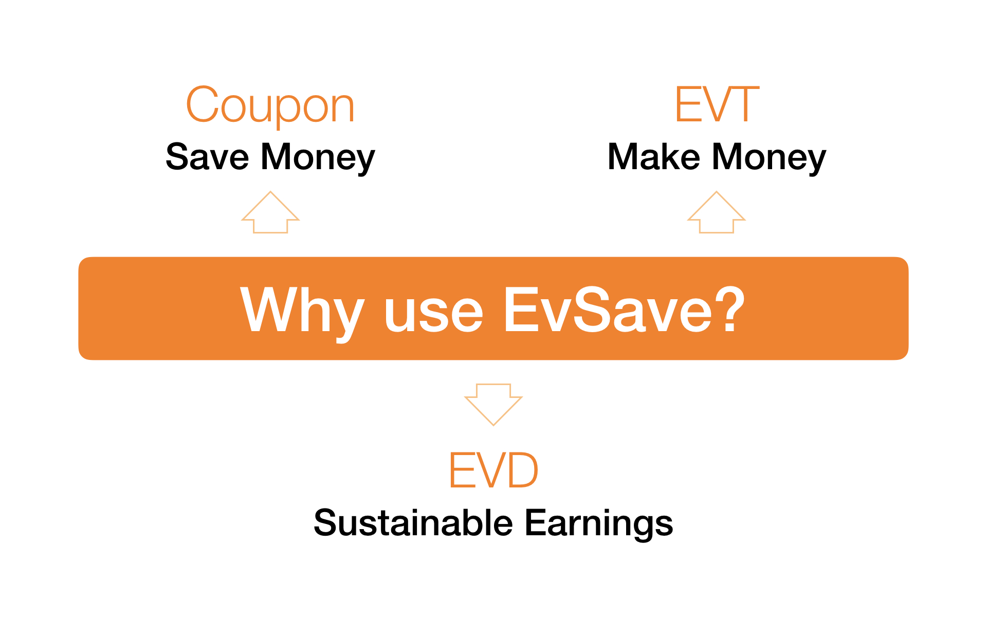
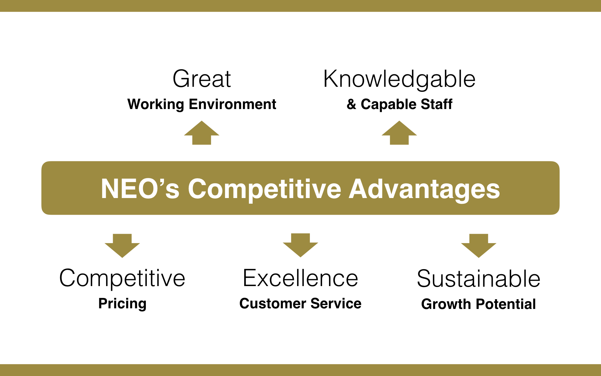
The slide title or the key message can be placed in the middle of the slide. By placing the key message in the middle of the slide, we create a focal point at the centre of the slide where key information can be seen easily from afar. We then apply a large font size to make the key message prominent.
Related information can then be placed strategically surrounding the key message. These related messages should be as short as possible and can be visually connected to the key message using block arrows. The whole idea is to break away from bullet-point text and make your slides more visual.
Slide idea #2
Use high-resolution images and expand images to fill the whole slide
It is always good to use images to engage your audience. Choosing appropriate images that accurately represent the content is important. When using images, always use high-resolution images. High-resolution images are sharp and easy on the eyes.
An image can be even more exciting if you expand it to fill the whole slide. Seeing an image extend from edge to edge can make your presentation slide come alive.


Slide idea #3
Box up the key message for better visibility
Sometimes the key message that sits on your slide doesn't seem to be quite visible or have enough prominence. To increase the visibility, put a box behind the key message text.
This can be easily drawn in PowerPoint and Keynote with the rectangle (or rounded rectangle) shape tool. This technique works particularly well when the key message sits on a busy image.


Slide idea #4
If it's important, make it really BIG
If you have a very important message, whether it is a number or a few words, position it in the middle of the slide and apply a really large font size. Shout it out! Make the text or number stand out among everything else.
This will inject excitement into your presentation, adding variety and visual impact. You may also include a simple image that resonates with your message for added impact.


Slide idea #5
Arrange multiple images neatly on the slide
It is good practice not to have too many images on a single slide. However, if you must have multiple related images on a single slide, it would be wise to arrange them neatly on the slide.
Leaving a narrow gap to separate each image will keep each image clearly defined. The slide title or a key message can be positioned in the centre or at the top of the slide if required.


There are many exciting ideas that we can adapt to ensure professional-looking slides that will help us deliver great presentations. It might take some practice at first if you have always been building your slides from the standard PowerPoint templates and have not been exposed to high-impact slide designs.
Paying attention to how slide content is designed, laid out, and positioned on the slide is important. A good design gives your slide content focus, makes it easy for the audience to understand, and helps the presenter deliver the message effectively.


